
Tableau Scatter Plot helps visualize the relationship between two data sets or measures (numeric columns). A scatter plot uses the default circle shape to display all data points at their respective intersections of two measures. You can use the Color and Size shelf to change the Mark color and size, so the user can easily recognize the categories.
While scatter plots in Tableau allow you to add multi-level data in the details shelf, it will increase the total marks in a report and confuse the user to understand the data. In the columns and rows shelf, you can add up to two measures to display separate scatter plots for each category or region.
This article will show you how to create a Scatter Plot in Tableau, add linear progressions and trend lines to express correlation, change mark size and shape, and add data labels to marks with an example.
How to Create a Scatter Plot in Tableau?
Scatter plots create a two-dimensional plane of a Cartesian coordinate system, representing data points as individual dots on the graph. The horizontal X-axis represents one measure, while the vertical Y-axis represents the second measure. Each dot on the Tableau scatter plot represents a data point in the dataset, and its position is the combination of the X and Y axis belonging to that particular data point.
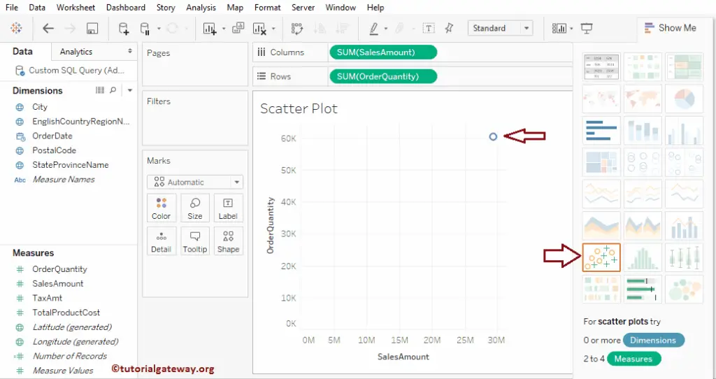
First, drag and drop the Order Quantity from the Measures Region to the Rows Shelf and the Sales Amount from the Measures Region to Columns Shelf. The Tableau desktop intelligence will automatically select the scatter plot, and if it does not, please select the below option from the Show Me window.
As you see from the above screenshot, the Tableau scatter plot shows the aggregated Sales and Order Measures data. But, we require to see detailed information. So, let me drag and drop the Postal Code from the Dimensions Region to the Details field in the Marks card.
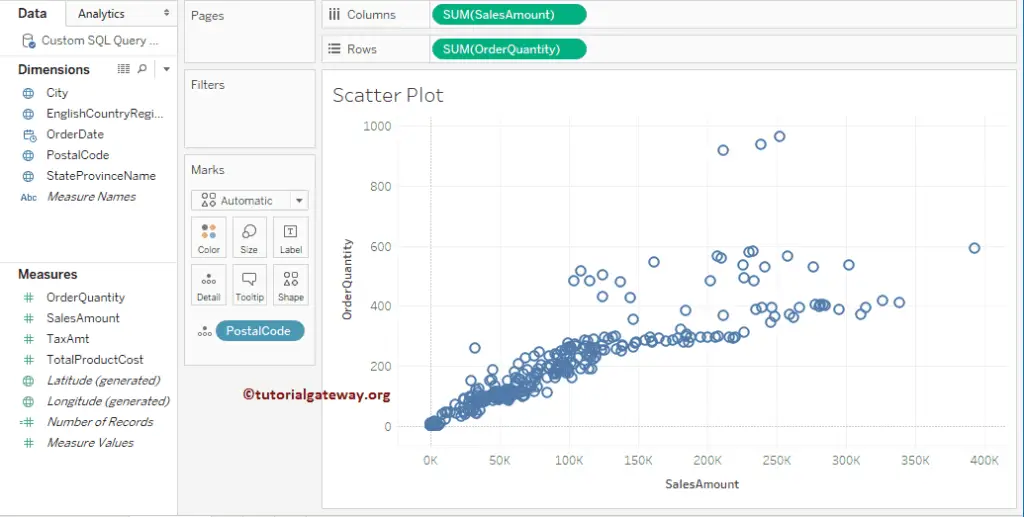
From the above image, each circle represents a Postal code, and the darker circle region has a large number of orders and sales.
Add Linear Progression to Tableau Scatter Plot
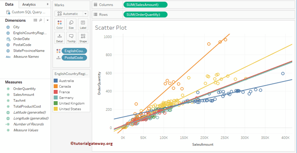
The Tableau Scatter plot or chart shows the relationships between numerical variables, and this example shows how to add linear progression. The desktop provides two different ways to add linear progression.
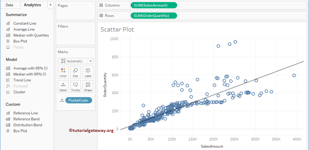
First Approach: You can add the progression using the Trend Line option available in it. To access this option, Please navigate to the Analytics tab.
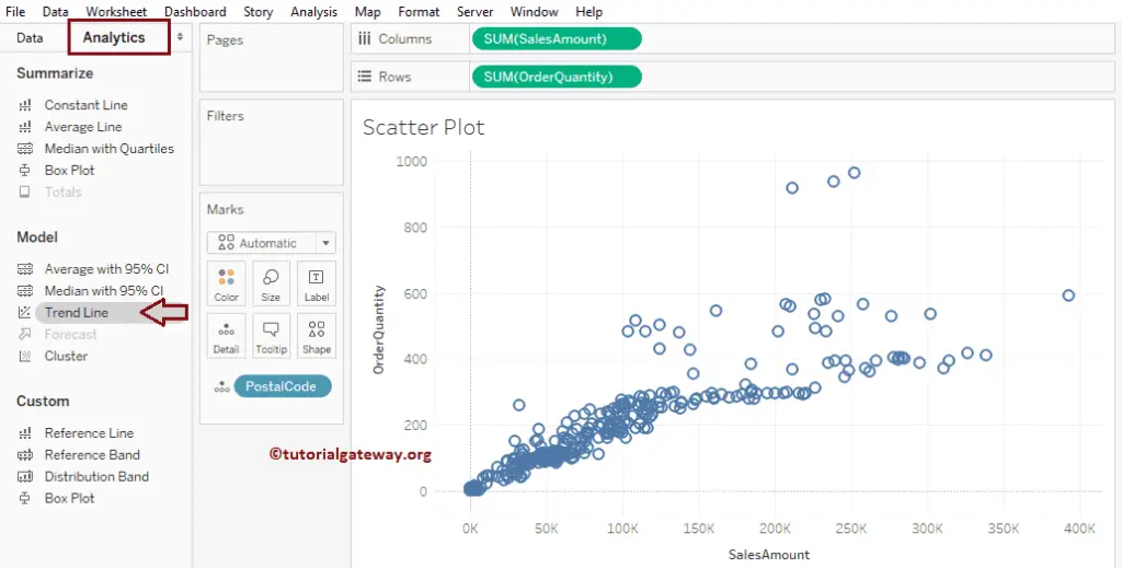
Next, Drag and drop the Tableau Trend Line to the drawing area. For more Charts, Click Here.
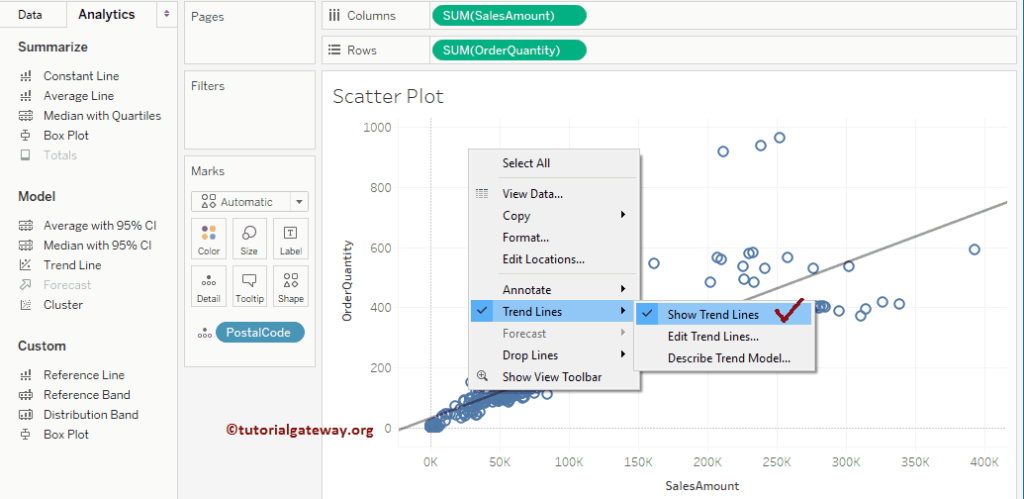
Second Approach: Right-click on the Tableau Scatter Plot report drawing area, select the Trend Lines, and click on the Show Trend Lines option.
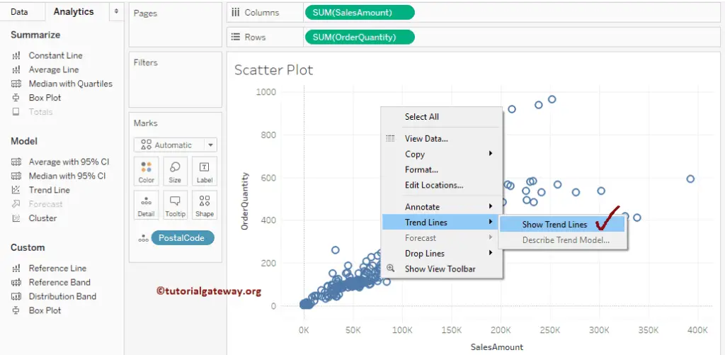
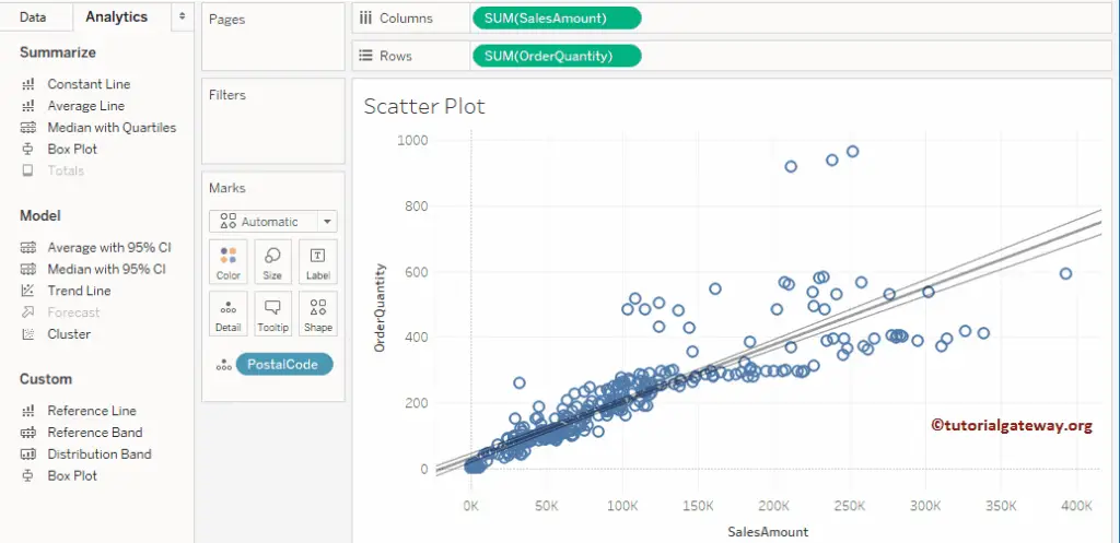
Once you click on the Show option, it will show the Trend and the confidence bands.
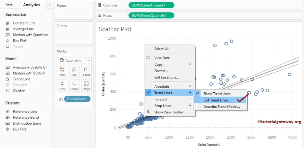
The Tableau desktop will add the confidence bands to the Scatter Plot Trend. line by default, but you can alter these default settings. To do so, right-click on the Plotting area, select the Trend Lines, and click the Edit Trend Lines …option.
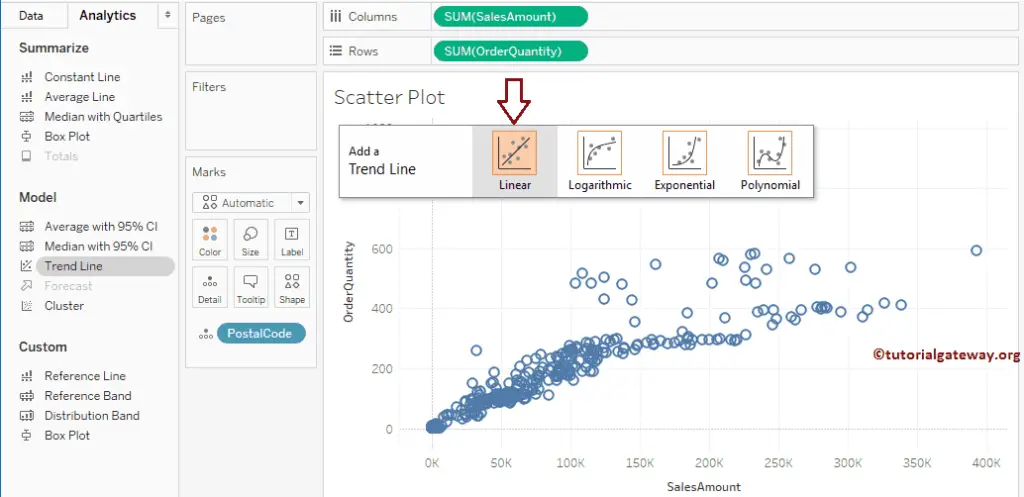
It will open a new window called the Trend Lines Options. You can change the default Linear Model to Logarithmic, Exponential, Polynomial, etc. Here, we will remove the Confidence bars. To do this, please uncheck the Show Confidence bands option.
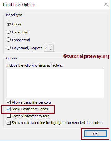
It removes the confidence bars from Scatter Plot.
Remove Trend Line
To remove the trend line from the Tableau Scatter Plot, right-click on the design area to open the context menu. Please select the Trend Lines and uncheck the Show Trend Lines option.
The following sections help you understand different kinds of options to change the appeal of the chart.
Add Colors to Scatter Chart
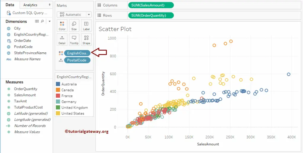
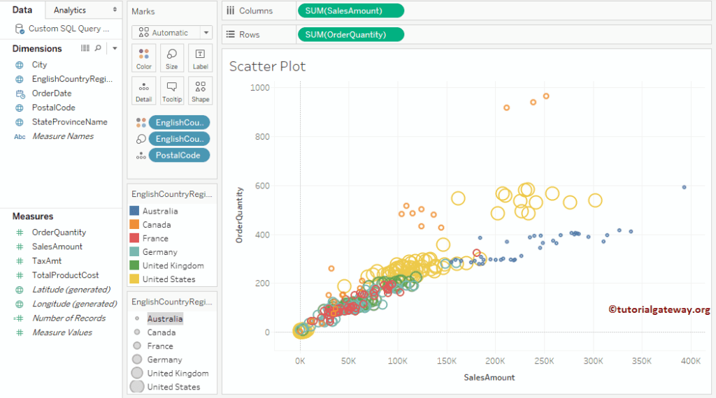
This example shows how to add colors to the Tableau Scatter Plot. For this, drag and drop the English Country Region Name from Dimensions Region to the Color field in the Marks card. It means each country has its own color.
Add Multiple Trend Lines to a Scatter Plot in Tableau
This example shows how to add the trend line for each region. Right-click on the drawing area, which will open the context menu. Please select the Trend Lines and click the Show Trend Lines option.
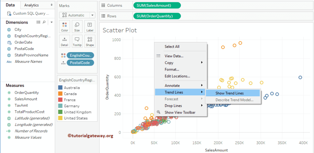
It will create the Trend Line or reference line for each country.
How to change the Tableau scatter plot marks Size?
Let me show you how to change the size of a Tableau Scatter Plot. For this, drag and drop the English Country Region Name from the Dimensions Region to Size field in the Marks card. It means each country has its own size.
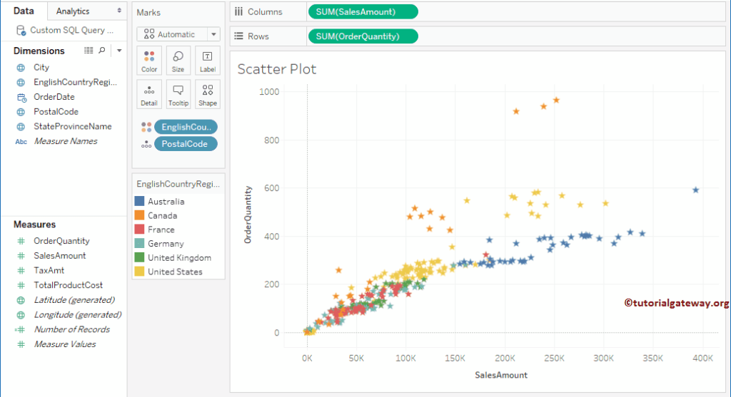
How to change the Scatter chart ring Shape?
To change the scatter plot default ring shape, click on the Shape field in Marks Shelf. It will open the list of available shapes. Please select the required shape.

We changed the default ring shape to a star
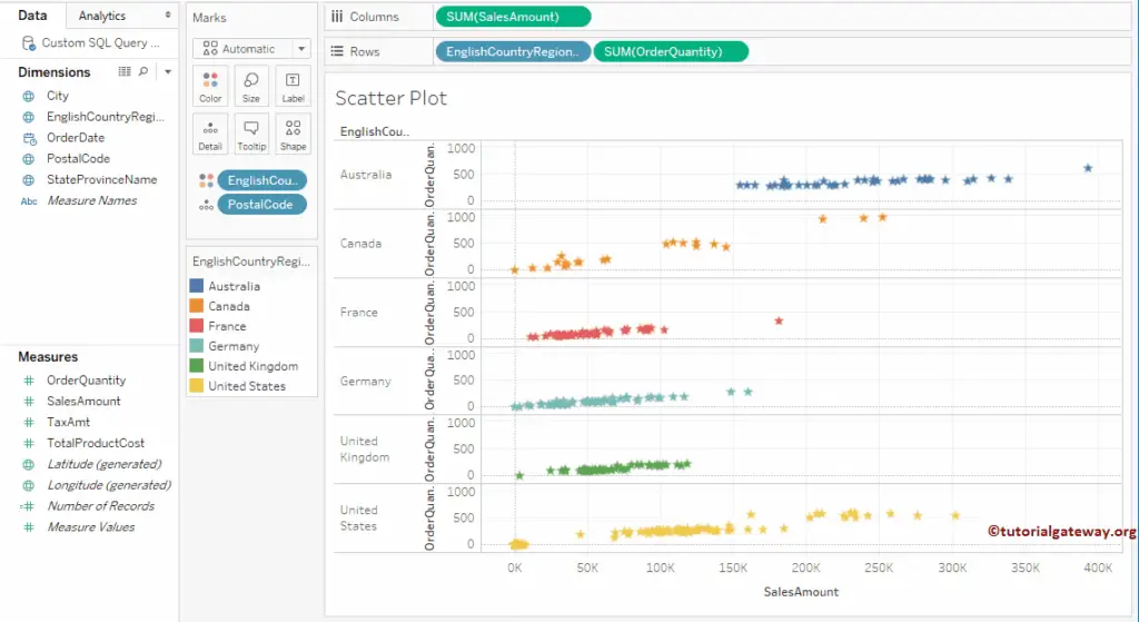
Create a Category wise scatter plot
To create a Tableau scatter plot or chart for each region, drag the English Country Region Name to Rows Shelf.
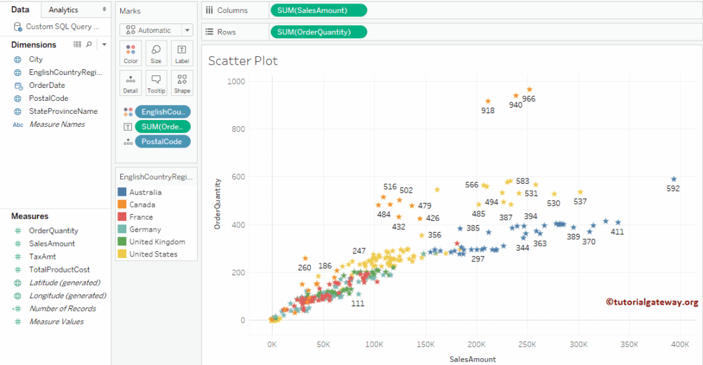
How to add Data Labels to a Tableau Scatter Plot?
It shows how to add labels to each dot in a scatter plot. For this, drag and drop the Order Quantity from the Measures Region to the Label field in the Marks card. It helps to see the level of detail data points.
FAQs
A scatter plot portrays many data points scattered in the Cartesian plane.
To visualize relationships between numerical columns or variables.