The Histogram in R Programming is very useful for visualizing the statistical information organized in user-specified bins (range or breaks). Though it looks like Barplot, R Histograms display data in equal intervals.
Let us see how to Create a Histogram, Remove its Axes, Format its color, add labels, add the density curves, and make multiple Histograms in R Programming language with an example.
R Histogram Syntax
The syntax to create the Histogram in R Programming is
hist(x, col = NULL, main = NULL, xlab = xname, ylab)
The complex syntax behind this to make Histogram is:
hist(x, breaks = "Sturges", freq = NULL, probability = !freq,
     xlim = range(breaks), ylim = NULL, col = NULL, angle = 45,
     include.lowest = TRUE, right = TRUE, density = NULL,
     main = NULL, xlab = xname, ylab, border = NULL,
     axes = TRUE, plot = TRUE, labels = FALSE,
     nclass = NULL, warn.unused = TRUE,..)
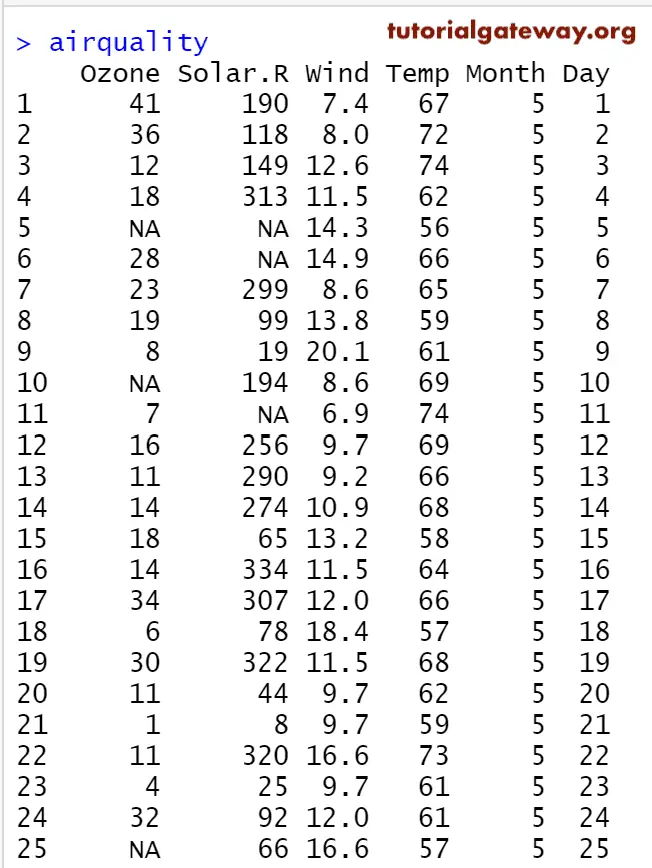
Before we get into the example, let us see the data we will use for this R Histogram example. airquality is the date set provided by RStudio.
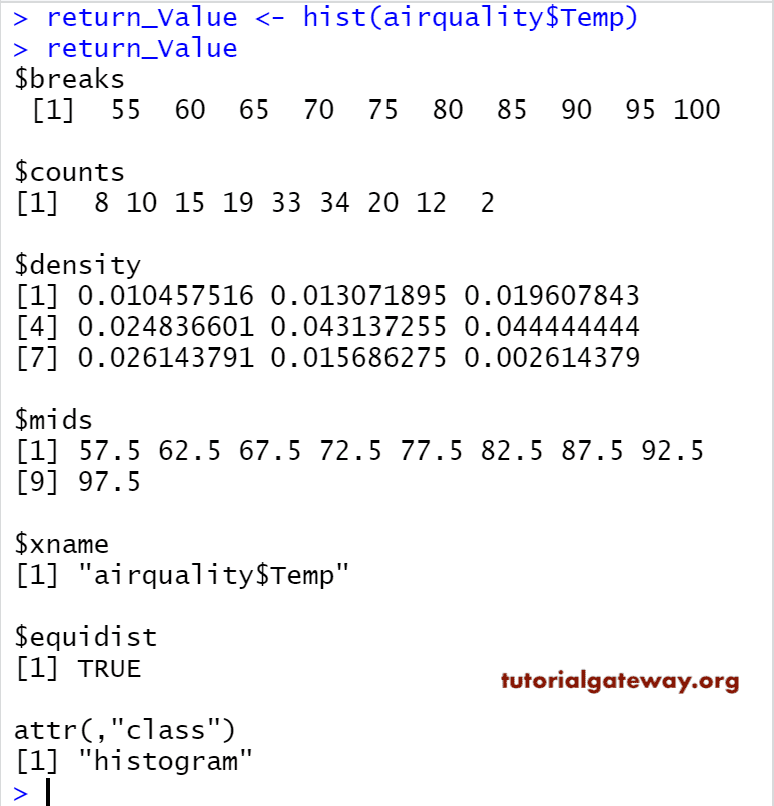
Return Value of a Histogram in R Programming
In general, before we start creating it, let us see how the data divide by the hist.
The R Histogram returns the frequency (count), density, bin width (breaks) values, and type of graph. In this example, we show how to get the information on the same.
airquality

return_Value <- hist(airquality$Temp)
return_Value
Create a Histogram in R Programming
In this example, we create a Histogram using R Studio’s airquality data set. If you require to import data from external files, then refer to the R Read CSV article to understand the CSV file import. And also, refer to the Barplot article in R Programming.
airquality

hist(airquality$Temp)
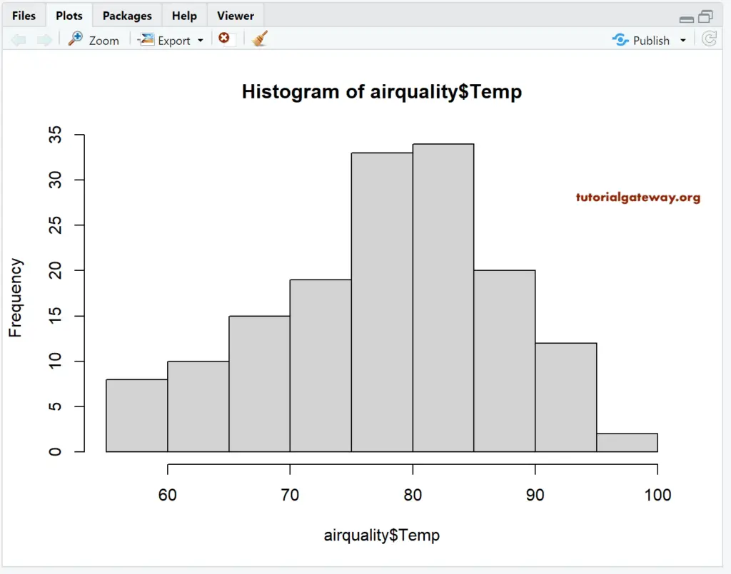
airquality data set returns the output as a List. So, we are using the $ to extract the data from the List.
hist(airquality$Temp)
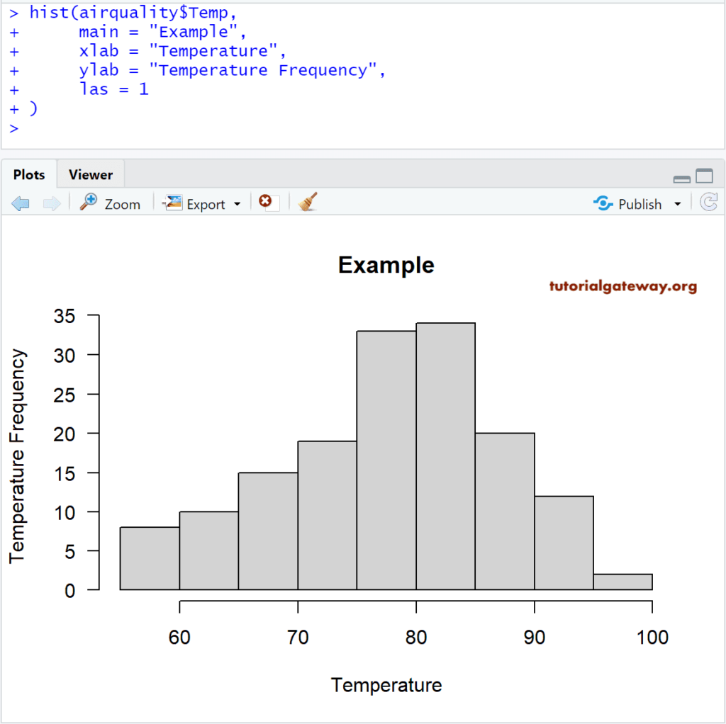
Assigning names to Histogram in R Programming
In this example, we assign names, X-Axis, and Y-Axis using main, xlab, and ylab
- main: You can change or provide the Title.
- xlab: Please specify the label for the X-Axis
- ylab: Please specify the label for the Y-Axis
- las: Used to change the Y-axis values direction
# Changing Axis Names
airquality

hist(airquality$Temp,
     main = "Example",
     xlab = "Temperature",
     ylab = "Temperature Frequency",
     las = 1
)
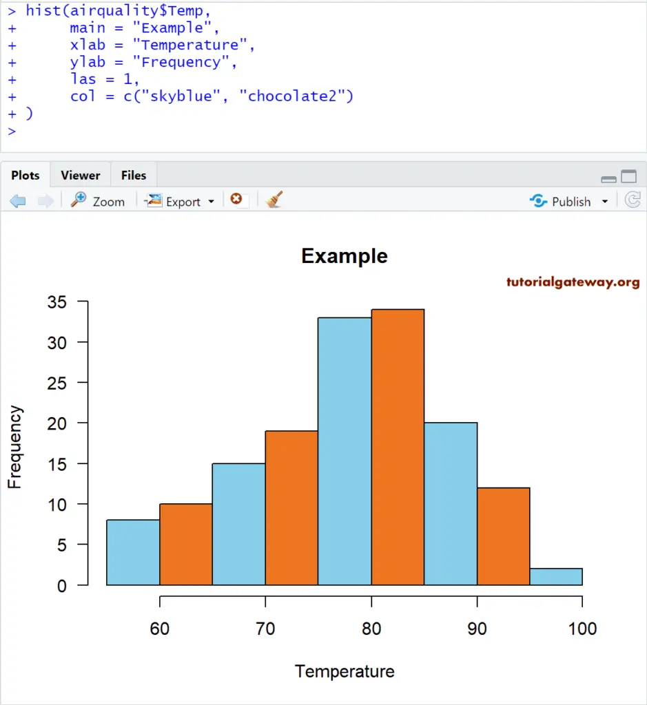
Change Colors of a Histogram in R
In this example, we change the color using the col argument
- col: Please specify the color you want to use for your Hist graph. Type colors() in your console to get the list of colors available in R programming
# Changing Colors

hist(airquality$Temp,
     main = "Example",
     xlab = "Temperature",
     ylab = "Frequency",
     las = 1,
     col = c("skyblue", "chocolate2")
)
From the above code snippet, you can observe that we used two colors for the col argument. It means those two colors are repeated until the end of the bars.
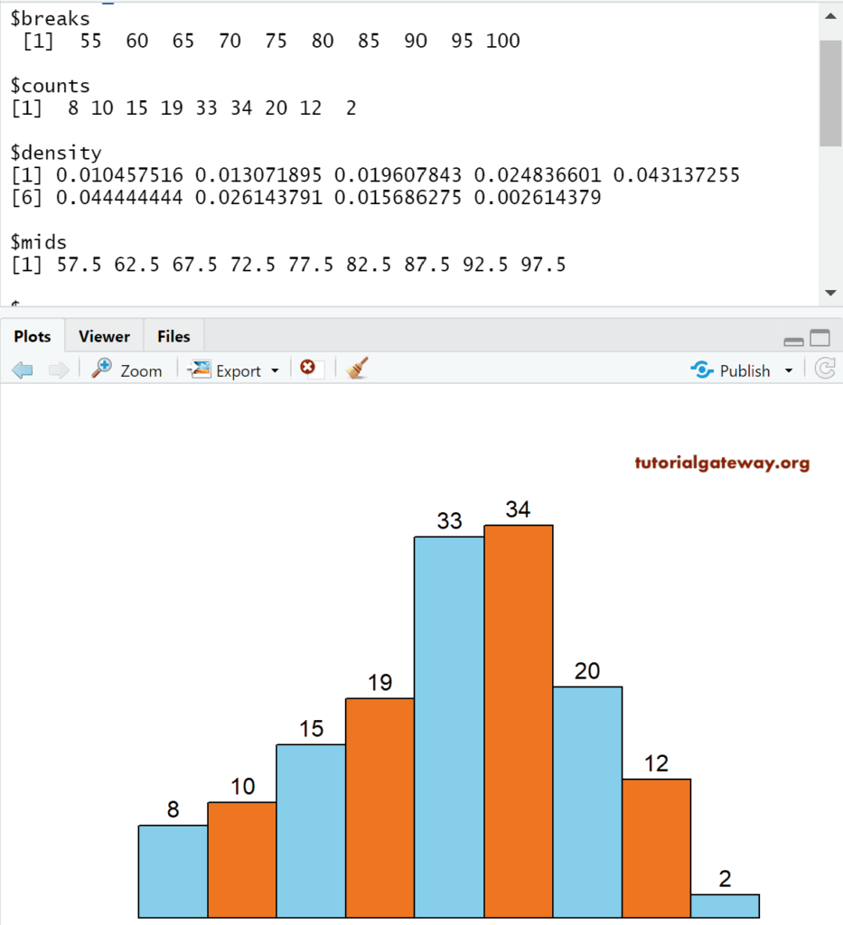
Remove Axis and Add labels to Histogram in R
In this example, we remove the X-Axis, Y-Axis, and how to assign labels to each bar in the R studio histogram using axes, ann, and labels argument.
- axes: It is a Boolean argument. If it is TRUE, the axis is drawn.
- labels: It is a Boolean argument. If it is TRUE, it returns the value on top of each bar.
- ann: It is a Boolean argument. If it is FALSE, remove the annotations from the plot area, which includes the name Axis Names.
# Removing Axis Labels
airquality

return_Value <- hist(airquality$Temp)
return_Value

hist(airquality$Temp,
     axes = FALSE,
     ann = FALSE,
     labels = TRUE,
     ylim = c(0, 35),
     col = c("skyblue", "chocolate2")
     )
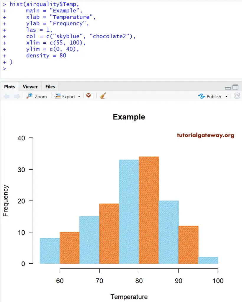
Change Axis limits of a Histogram in R studio
Let us change the default axis values and bar density using the density argument. They. are density, xlim, and ylim.
- xlim: This argument can help you to specify the limits for the X-Axis
- ylim: This argument may help you to specify the Y-Axis limits. In this example, we are changing the default y-axis values (0, 35) to (0, 40)
- density: Please specify the density of the shading lines (in lines per inch). By default, it is NULL, which means no shading lines.
# Changing Axis Values
airquality

return_Value <- hist(airquality$Temp)
return_Value

hist(airquality$Temp,
     main = "Example",
     xlab = "Temperature",
     ylab = "Frequency",
     las = 1,
     col = c("skyblue", "chocolate2"),
     xlim = c(55, 100),
     ylim = c(0, 40),
     density = 80
)
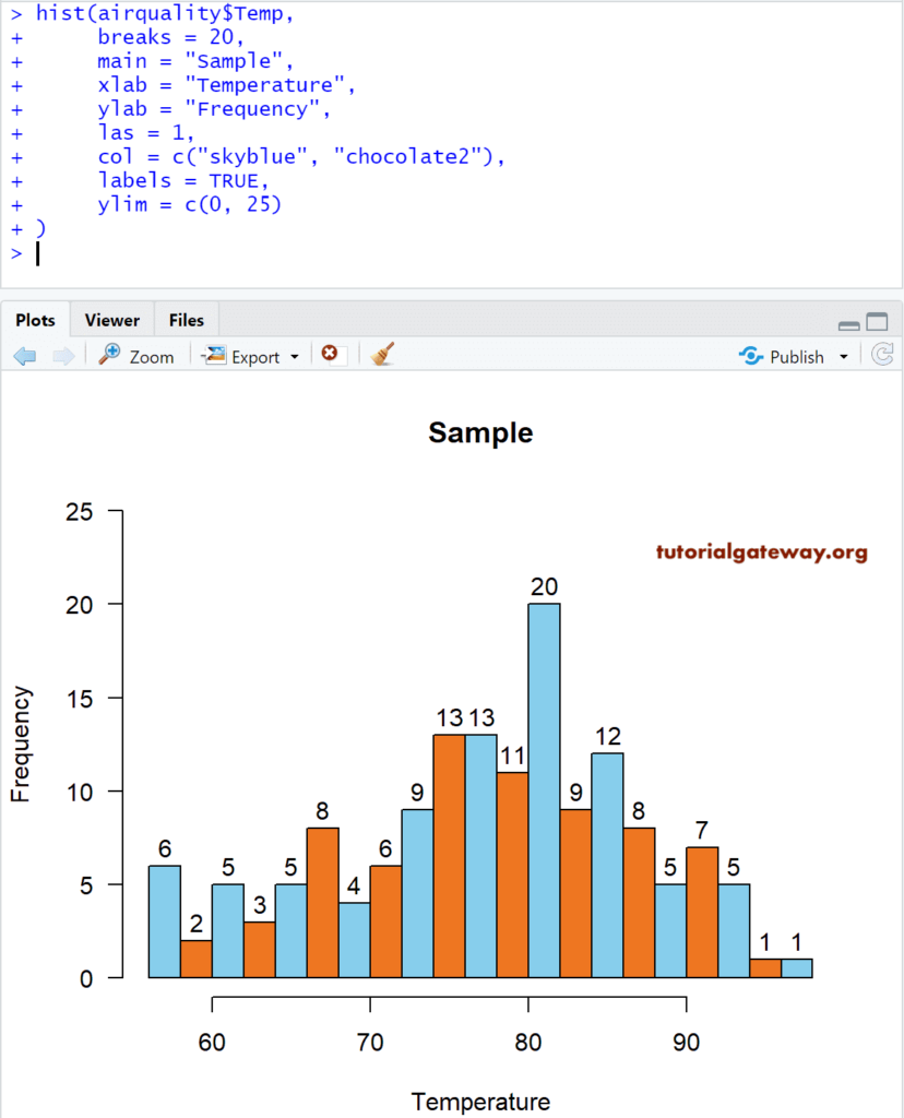
Changing Bins of a Histogram
Let us see how to change the Bin size of the R histogram using the breaks argument.
- You can use a Vector of values that specify the breakpoints between cells.
- You can use a number that specifies the number of cells it has to return. For example, breaks = 20 means 20 bars returned.
- You can use a function that returns a Vector of breakpoints.
# Changing Bin width
airquality

return_Value <- hist(airquality$Temp)
return_Value

hist(airquality$Temp,
     breaks = 20,
     main = "Sample",
     xlab = "Temperature",
     ylab = "Frequency",
     las = 1,
     col = c("skyblue", "chocolate2"),
     labels = TRUE,
     ylim = c(0, 25)
)
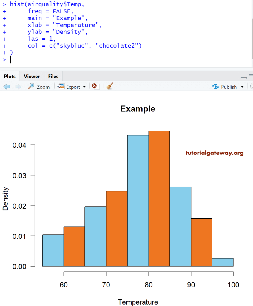
Create an R Histogram with Density
Frequency counts and gives us the number of data points per bin. In real-time, we are more interested in density than the frequency-based ones because density can give the probability densities.
In this example, we create a this against the Density, and to achieve the same, we have set the freq argument to FALSE.
# Density Values
airquality

return_Value <- hist(airquality$Temp)
return_Value

hist(airquality$Temp,
     freq = FALSE,
     main = "Example",
     xlab = "Temperature",
     ylab = "Density",
     las = 1,
     col = c("skyblue", "chocolate2")
)
Adding Density Curve
In this example, we add the density plot or curve to the Histogram in R studio using the lines function.
#  Add Density Curve
airquality

hist(airquality$Temp,
     freq = FALSE,
     main = "Example",
     xlab = "Temperature",
     ylab = "Density",
     las = 1,
     col = c("skyblue", "chocolate2")
)

lines(density(airquality$Temp), lwd = 4, col = "red")
The following statement draws a density curve
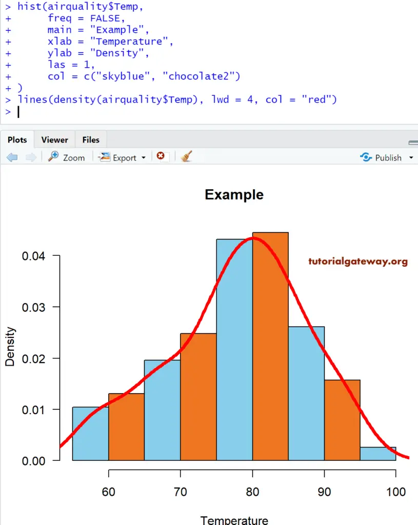
lines(density(airquality$Temp), lwd = 4, col = "red")
TIP: lwd argument change the width of the line
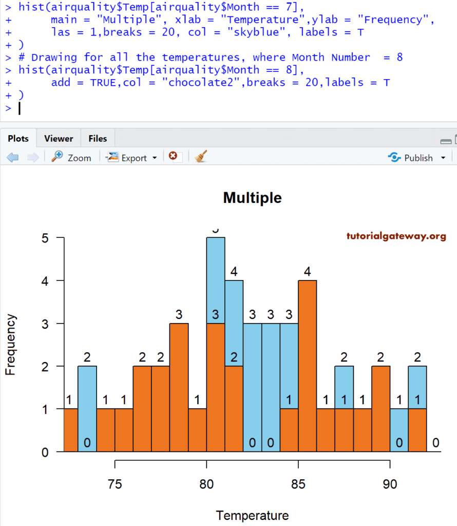
Add Multiple hist
In this R example, we add multiple Histograms to the plot region.
hist(airquality$Temp[airquality$Month == 7],
     main = "Multiple",
     xlab = "Temperature",
     ylab = "Frequency",
     las = 1,
     breaks = 20,
     col = "skyblue",
     labels = T
)

# Drawing for all the temperatures, where Month Number  = 8
hist(airquality$Temp[airquality$Month == 8],
     add = TRUE,
     col = "chocolate2",
     breaks = 20,
     labels = T
)
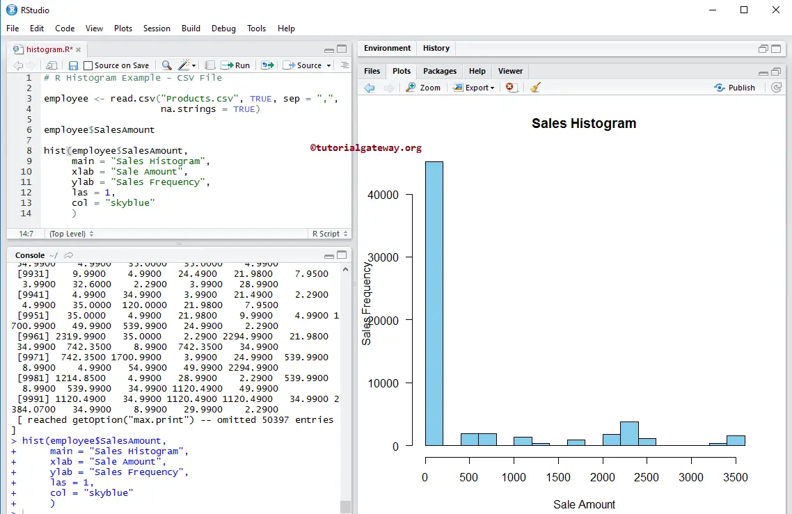
Creating R Histogram using CSV File
Let us see how to create a Histogram in Rstudio using the external data. For this, we are importing data from the CSV file using the read.csv function. Please refer to the R Read CSV article.
# CSV File

employee <- read.csv("Products.csv", TRUE, sep = ",",
                     na.strings = TRUE)

employee$SalesAmount

hist(employee$SalesAmount,
     main = "Sales",
     xlab = "Sale Amount",
     ylab = "Sales Frequency",
     las = 1,
     col = "skyblue"
     )
The above code snippet computes the hist of the given data in the CSV file for the Sales Amount.