
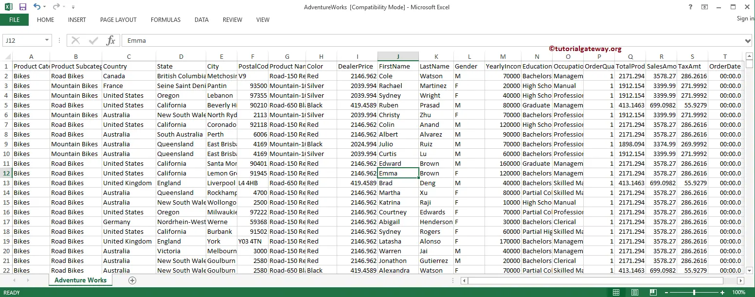
The grid Chart in QlikView is similar to Scatter Plot. However, Grid Chart uses the Dimension values on X-Axis, Y-Axis, and use an expression to visualize the data. To Create a Grid Chart, use the following Excel table data.
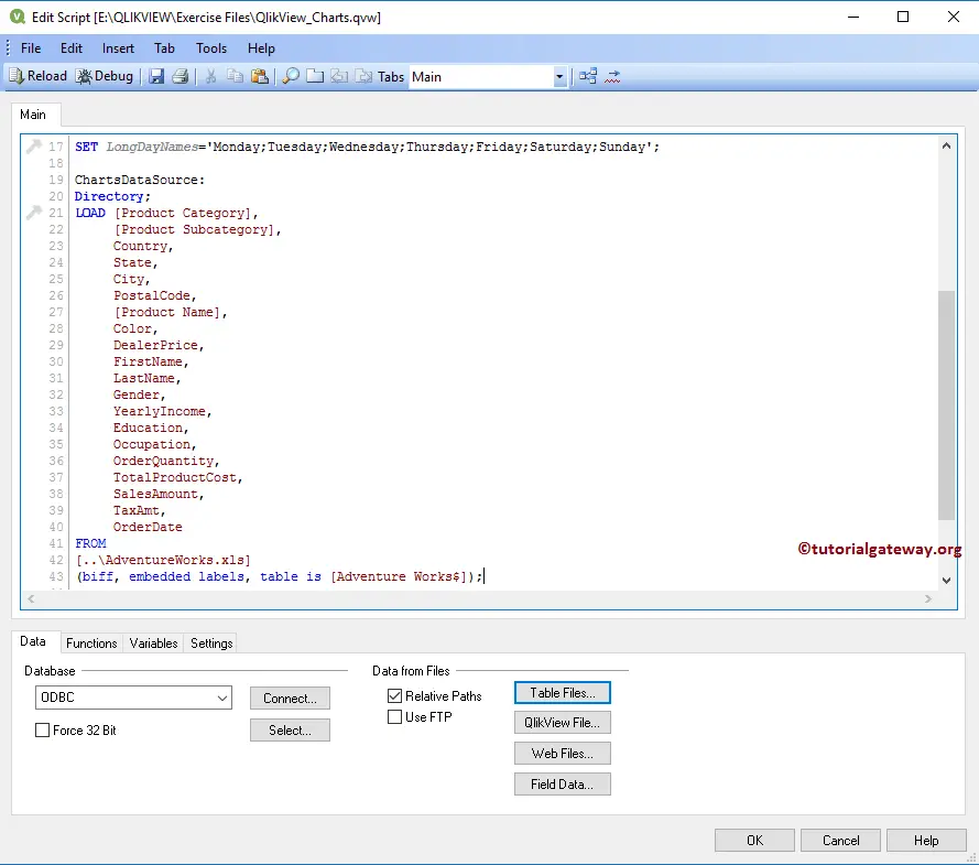
From the screenshot below, see that we are loading the above specified excel sheet into the QlikView, and we use it for grid chart.
Create a Grid Chart in QlikView
In this example, we create a Grid chart using the Country, Color, and Profession Columns as the dimension data and the Sales Amount as an expression.
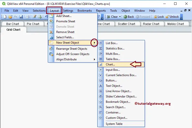
We can create a QlikView Grid chart in multiple ways. First Approach: Please navigate to Layout Menu, select the New Sheet Object, and then select the Charts.. option
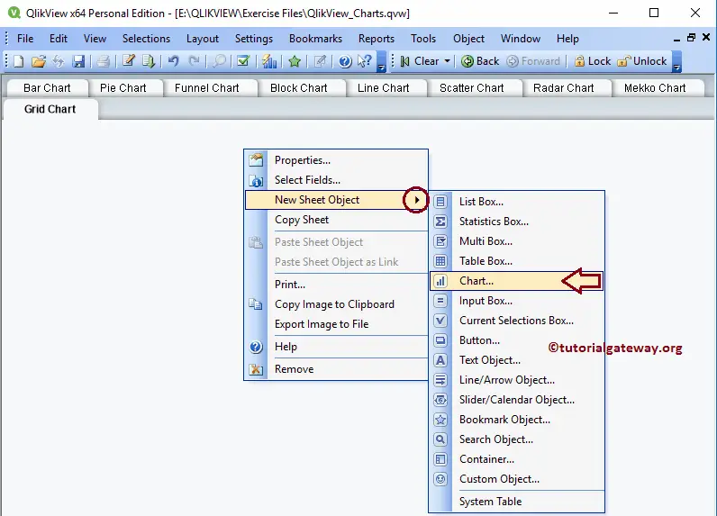
Another approach is to Right-click on the Report area and open the Context menu. Please select the New Sheet Object and the Charts.. option.
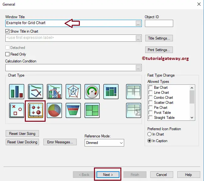
Either way, QlikView opens a new window to create a Grid Chart. Here, we assigned a new name called Example for Grid Chart and selected the Grid Chart as the chart type.
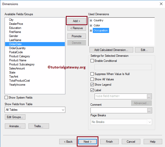
Please select the Dimensions (columns) that you want to use in your Grid chart. For this example, we are adding the Country, Color, and Occupation dimensions to the used dimension section. It means it will add the Country to X-Axis and Color dimension to Y-Axis. Please refer to Import data from the Excel article to import the excel tables into QlikView.
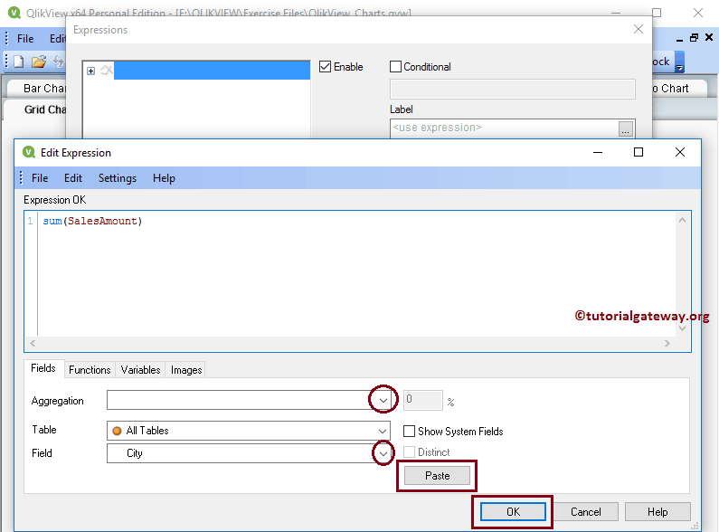
Clicking the Next button opens an Expression page, and on top of that, a pop-up window called Edit Expression opens. Use this window to write the custom expression.
Here, we are writing an expression under the Expression OK section. If you do not know how to write an expression, then select the Filed as Sales Amount, Aggregation as Sum, and click the Paste button. The size of the Bubble or symbol depends upon this expression value.
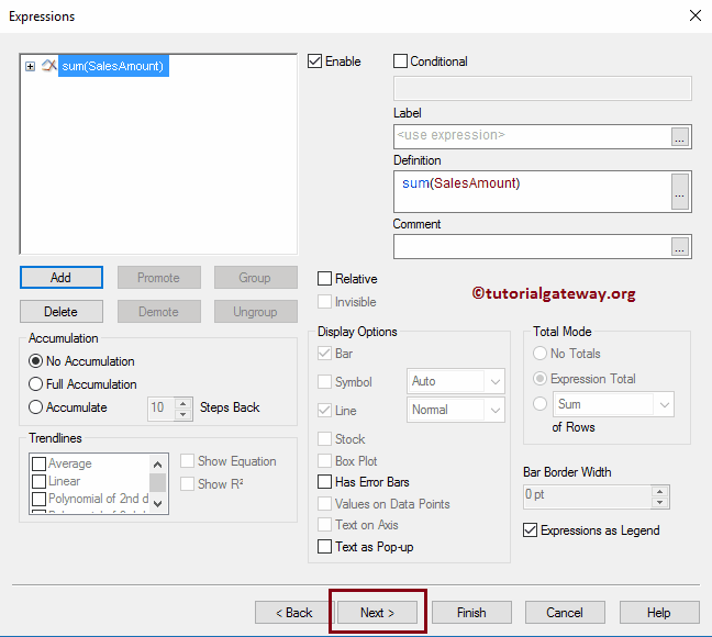
Click the OK button to close the edit expression window and click the Next button.
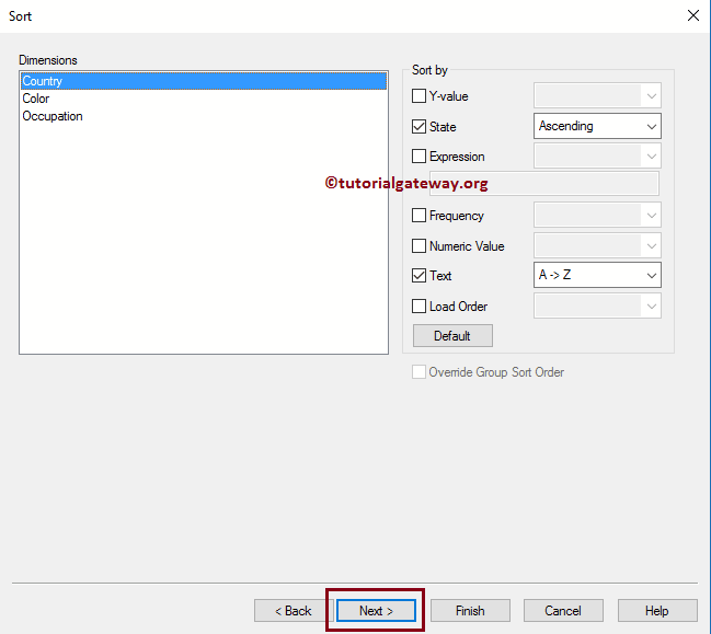
Specify the sorting order for the dimensions in this Sort page. In this QlikView Grid Chart example, we sort the Country in Ascending or Descending order.
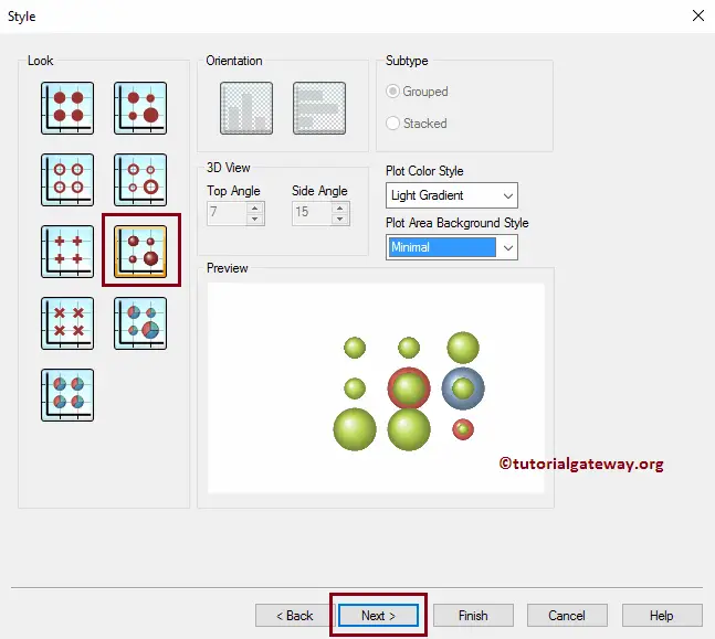
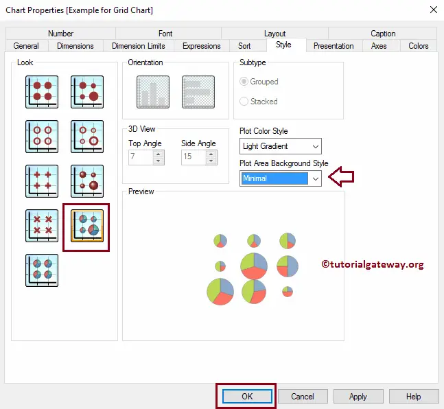
The next page is to change the look and style of a grid chart. Let us change the Plot Color Style to Light Gradient and the Plot Area Background Style to Minimal.
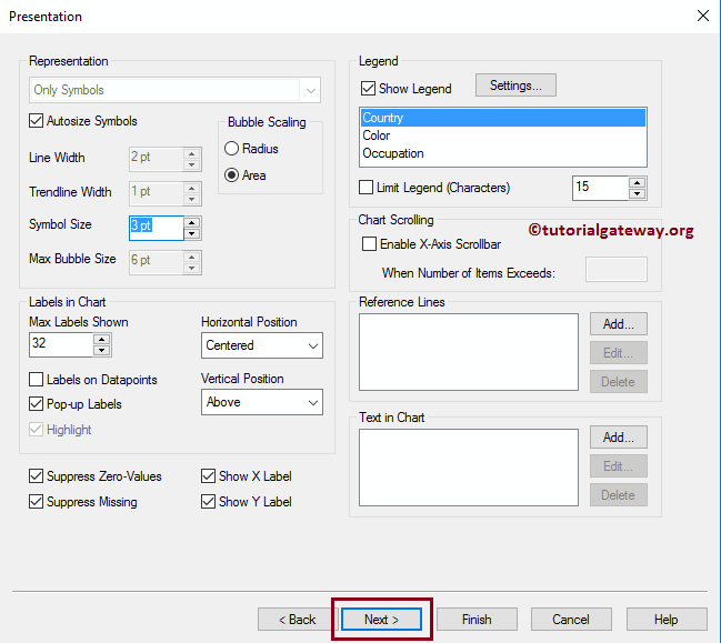
The presentation page changes the Presentation of a Grid chart. For example, change the Symbol size, enable axis scrolling, etc. For now, we changed the Symbol size to 3pt.
Use this Axis page to change the X-Axis and Y-Axis settings.
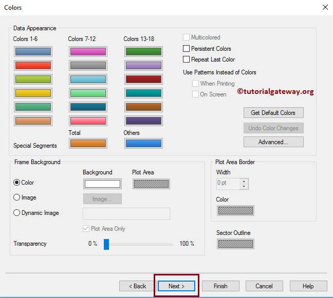
The Colors page is useful for changing the Color pattern of the QlikView Grid chart. Try different options
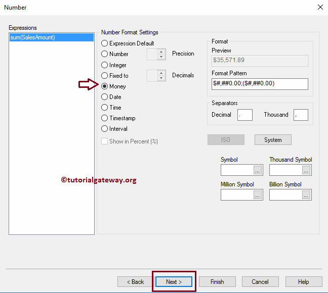
Formatting the Expression value: As we all know that the Sum of Sales Amount is money, we are selecting the money.
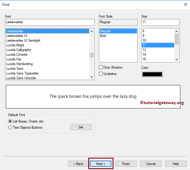
Use this QlikView Grid Chart Font page to change the font family, style, and font size. Here, we changed the Font = Leelawadee, and Font size to 11
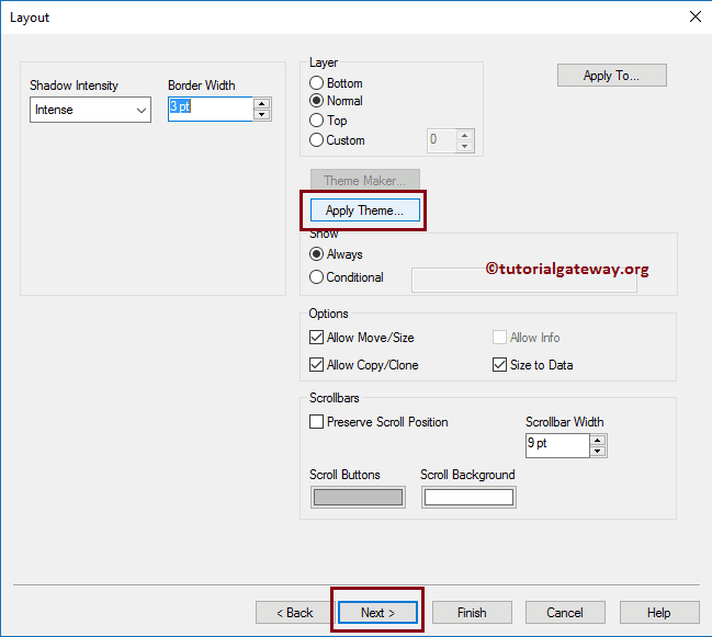
Use this Layout page to provide the shadow effects to Grid chart, or apply the custom theme by clicking the Apply Theme button. From the screenshot below, see we changed the shadow intensity to Intense and Border width to 3.
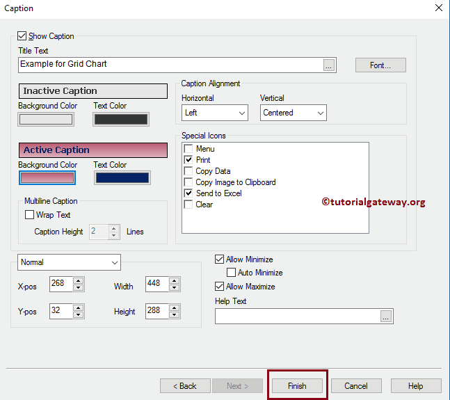
The caption page is to style the QlikView Grid Chart Caption. Here, change the Grid chart background, position, color, and so on. From the screenshot below, see we changed the Active Text colors and the background color. Once done, click the Finish button
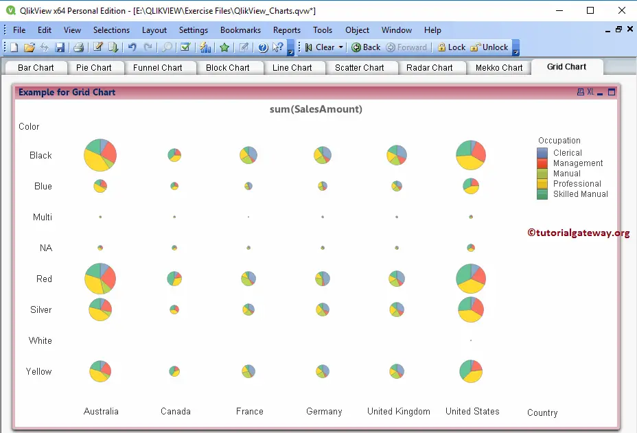
Now, see our newly created Grid Chart.
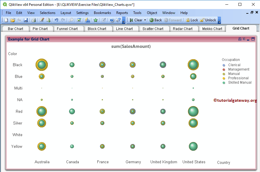
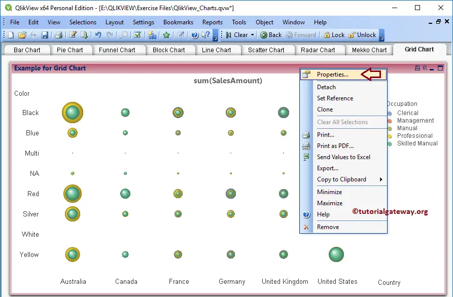
Through the above chart fulfilled our requirement, we are unable to identify the Occupation with the least sales. Let us change the Chart style. To do so, right-click on the Chart and select the properties option from the context menu.
Clicking the properties option opens a new window called Chart Properties. Please navigate to the Style tab, and change the Look.
Now, see that the Grid chart is displaying the Pie Charts instead of a bubble chart.
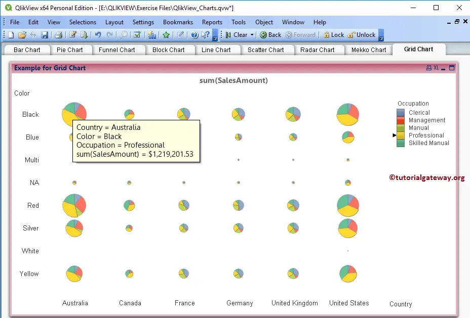
Let us hover over the mouse on the Pie chart. See that it displays the Country Name, Color, Occupation, and Sales amount (Data label).
Please refer to the Scatter Plot article.