An Individual Axis in Tableau is obtained by adding measure(s) into the Rows or Columns Shelf. This article will show you how to create an Individual Axis in Tableau with an example.
For this Individual axis demo, we will use the Data Source we created in our previous article. So, Please visit the Data Labels in the Tableau Reports article to understand the Tableau Data Source.
Individual Axis Example
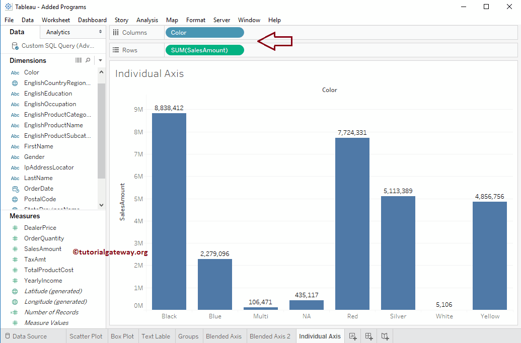
In order to show the Individual Axis in Tableau First, Drag and Drop the Color from the Dimension Region to the Column Shelf. Next, Drag and Drop the Sales Amount from the Measures Region to the Rows Shelf. Since it is a Measure value, the Sales Amount will be aggregated to the default Sum. Once you drag them, the following Chart report will be generated.
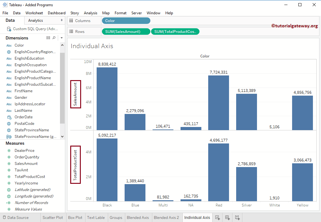
Next, Drag and Drop one more measure value, i.e., Total Product Cost from Measures Region to Rows Shelf. Because it is a Measure value, Total Product Cost is aggregated to the default Sum. From the screenshot below, you can observe that Tableau has created an individual axis for each measure.
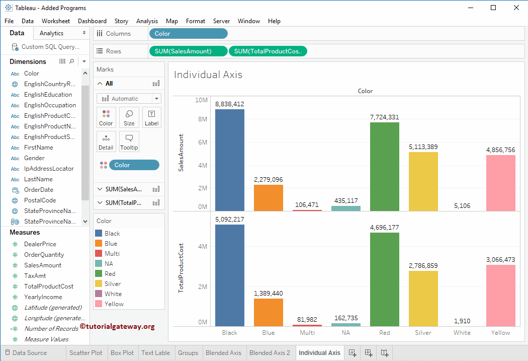
We just added the Colors to the Bar chart by adding the Color Dimension to the Color field present on the Marks shelf.
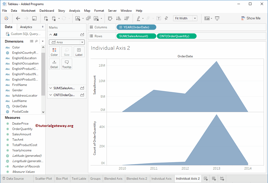
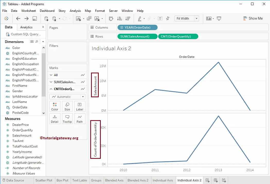
Individual Axis in Tableau Line Chart
In this example, we replaced the Color value with the Order Date dimension (Year) and the Total Product cost with the Order Quantity. This will produce the line chart. If not, change the Marks from automatic to Line type.
From the below screenshot, you can observe that we have changed the Marks type from a Line chart to an Area chart.